Thursday, November 29, 2007

POSTERS, POSTERS & MORE POSTERS

GOING through my on-line portfolio I realized that I've done over 200 flyers for various shows/tours/bands/events in the past 8 years. It's weird to think back at all the good times I had at these events, seeing those amazing shows & the people I met. The hard thing about doing flyers and tour posters, to me at least, is keeping a consistent look for each band and/or creating a look only for one show.


THE hardest band to consistently come up with creative ways to present the image they were going for was The Rushmore Academy. (http://www.myspace.com/rushmoreacademy) I'm not what you would call "hip to what kids like" or "current kid fashions" and I don't really think I have been since I stopped working at Hot Topic in 2002. Rushmore is a very pop-punk-rock project from St. Louis who, like most pop-punk-rock bands, make a living off of selling their look as much as their music.


WITH Step On It! it was a lot easier for me to convey a message since I was an active member of the band for several years. We had an established sort of feel for our winter tour simply based off of the 7" we had recently released. Working with Collective Records was another great project simply because everybody I worked with was either a good friend or a good band that I could get good sense of who they were.


RECENTLY I've been trying to slowly take on more freelance projects with bands again. I stopped doing them about a year ago, simply because of lack of time & interest in being ripped off. Loving music, the bands you work with & just helping people out is a great way to get into some shows for free. Just a helpful tip...

Wednesday, November 21, 2007

ARTIST SPOTLIGHT: JIM CONWAY

JIM Conway is a friend/co-worker that I've really come to idolize and respect as both a person and artist. The first few things I learned about Jim included playing softball with the Beastie Boys in NYC, cleaning a blender for an entire 8 hour work shift & (of course) his glory days as a vertically challenged power forward for his beloved highschool, the Mercy Bulldogs.


ABOUT 5 months ago I decided to bring in my MONSTER BOOK (blog coming soon) project to get some feedback from my co-workers. As part of the concept for the book I have several "guest artist" (mostly friends) that will draw a random page. When I showed Jim the book he asked if he could do a sketch. Since I had never seen any of his artwork, I was a little skeptical. Little did I know that Jim was one of the best illustrators I've ever met.


ANOTHER project that Jim does for each of the production/design team is a birthday envelope with whatever interests a person has and a matching stamp. For my envelope Jim created a wonderful Dark Knight super hero sketch that is truely awesome. I've asked Jim to find me more of his work and I'll update when he delivers.

Monday, November 19, 2007

I'M SICK OF THESE MOTHERF#çKIN' SNAKES

EVERY monday night for the past two years I've gone up to Saratoga Lanes for league nights. While the people who go are some of the best people I've met in my life, it's still great to crush my foes with my 140 average (140 is probably being charitable). Last year we (my old team) faced a rather interesting situation. We had a show down with our arch rivals, the Handsome Brothers (who are not handsome OR brothers), who basically are an all-star team. Luckily the big showdown wasn't until after Christmas break so we had plenty of time to recover and prepare. After seeing the Handsome Brothers frolic around with there cute little powder blue bowling shirts, I decided enough was enough! I went to work on creating a uniform design for the SNAKES ON THE MOTHERF#CKIN' LANE.


THE original concept, obviously, was taken from the, what i can only assume will be cult classic, Snakes of a Plane. In the movie (for those smart enough not to have waisted the $7 to not see it) a bunch of snakes get loose on a plane and Samuel L. Jakcson is the only man who is brave enough to save them. Taking the movie poster logo I started sketching out some ideas. The original draft (above) seemed to lack some life and aggresion that we snakes showed every monday evening.


WHEN I went back and tweeked the image I kept in mind that the snake should probably be bowling a hook into a perfect strike with exploding pins. The end result came out looking a lot better then I had originaly expected. Needless to say, when we showed up with matching uniforms, the (not so) Handsome Brothers knew they had met their match (plus a 200 pin handicap) as we took 6 of 7 points. Also, Thanks again to the wonderul Dan Z for helping me screen not only the shirts but the matching bowling towels (uh huh thats right!).

Thursday, November 15, 2007

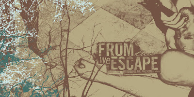
FROM THIS I'VE ESCAPED

IT has been some time since I have done any work for bands. Truthfuly, after about 5 years of intense work getting my name out there, dealing with a full time job & 7 nights a week of freelance work, I just burnt myself out. That being said, the last project that I really had the chance to work on was for "From This We Escape". The band had recorded this album months before they broke up and many people thought the album would never see the light of day. Luckily, Dark Front records owner (and St. Louis legend) Deye Mofo decided he wanted to release this album to remember the good times of the band.


THE first round of proofs produced a concept that was a back tray to cd booklet "one piece" cover. The idea was to give an interesting package layout that was a little out of the "norm". The proof recieved mix results and I was asked to produce another concept. Unfortanetly this request would produce a about a 8 month hold on the project as Deye Mofo ran into some bad luck with his car. The project was thought to be a lost cause.


ABOUT a year after the first proof was presented, Deye Mofo called me up and asked if I was still interested in doing the layout. I agreed to give it another shot since at the time I was not swamped with work & I never like seeing something unfinished. The second round of proofs was left to me to come up with the concepts and planning. After a few nights of sketching and concepting the above cover was produced.


AGAIN missing the mark Deye Mofo and I discussed what exactly he was trying to show with this release. After a very long conversation I went back to work with the notes and sketches from the brainstorm session. The following images are what came from the conversation and oddly enough the proof was approved. Unfortanetly as the final "t" was being crossed, Deye Mofo again ran into financial problems and the project never saw the light of day. It was still a great experience and I hope someday the album comes out.


Thursday, November 1, 2007

ARTIST SPOTLIGHT: THE SMALL STAKES

JASON Munn is a midwestern boy who now lives in Oakland, CA and also the main man behind The Small Stakes. The Small Stakes started out as an extracurricular itch and love for contemporary music in 2003. By meeting the growing demands of his talent and expertise, Munn rode the transition wave from doing something for the love of doing something to it being his source of full time employment. The Small Stakes has unfolded into an independent design studio consistently churning out award winning design work.


LAST October I fueled up my beat up somewhat black (some say purple) Saturn and drove down to Indiana to see Mark Kozelek. I told myself, on the drive, that I would get some kind of merchandise to remember this trip. When I walked up to the merch booth for Mark, I was struck by these beautiful hand crafted silkscreen posters. Jason Munn Instantly became one of my favorite modern designers. His simplistic and amazingly creative eye has inspired me not only in a creative way but as a goal to do something you love for a living.

Wednesday, October 31, 2007

NEVER TRUST A MAN NAMED "BOOBIE"

AS a child growing up in lovely South County | Affton area my family raised me on a healthy dose of three dog night & fleetwood mac. I remember drawing Mr. T in various forms with my dad who would be drawing birhtday posters for people at work/family members while listening to KSHE 95 (real rock radio). From these early memories I realized if I could combine my love for music with my love for art/design I would achieve my perfect job.

ABOUT two years ago I was asked to work on some artwork for a semi-local, semi-talented tough guy/mosh band from Springfield, IL. At the time I was really into working with bands and trying to help out a scene that I really had no reason being apart of, outside of being in a band that was loosely related. Regardless, Pound For Pound came to me with a loose concept that they described as "an album for our friends who we lost this past year." They wanted to use very gloomy/drab imagery with a color palette of reds, blacks and white.


WHEN Pound for Pound dropped off their album info, they mentioned that they only really needed a few "tweeks" to a layout they already had set up. When I opened the disc I found a nice window doc and a low res dpi image of what looked like a funeral procession. I quickly went to work trying to set up a look that would show the bands "gloomy" imagery while keeping a kind of "hand crafted" look.


THE first round of proofs went over pretty well. Sadly, the patience of the band quickly evaporated as "whenever you get it done" apparently means "we want it done 2 weeks ago." The project was never 100% completed, but these images show the layout and the feel of the album. Lesson learned? Springfield, IL is not only the worst city in the world...it also breeds the worst people in the world (sorry Coder).


Tuesday, October 30, 2007

MY HHX [in review]

HHX, for those who haven't talked to me in the past 2 months, is short for Hoop Hall Experience. Which for the first time in history, the Basketball hall of Fame is on tour. The hoop hall experience is where the story of basketball comes to life in over 22,000 square feet of "fun". With something for basketball lovers of all ages, from the heart-pounding "greatest moments" theater to the state-of-the-art interactive displays. Historic memorabilia like Wilt Chamberlain's 100 point jersey (which I wore), the original 24 second clock, and more. Clips of the greatest players, most memorable games and most inspiring coahces.

ANYWAY, the agency I work for asked me to put together some concepts for the commemrative program. In the piliminary stages of brainstorming the creative concept was a blending of "urban" with "white space" and "type is bad". Below is the only cover/back cover concept that I created, and the client bought into.


TIMELINE for this project ended up being super tight (as most projects eventually turn into) and the amount of hours given to create the 40 page book worked out to be about 1 hour per spread. With that in mind the concept (to save time and money) was to create a visually stimulating header page matched with a page of white space & images. Following each main chapter (for exmple "the modern game") there would be a two page spread of NBA artifacts to help relax the eye before beginning a new section.


ROUND 2 of revisions led to the introduction of lowering the target age group to be 9 to 90. The task went from adding an almost seek and find quality to a slick layout to try to make history fun for kids. The problem, outside of the basic "oh shit the entire direction has changed", is kids (in the age group of 9 - 14) are 99.9% more likely to pick up a tshirt or mini basketball than a book. After a few hours..er days of problem solving we came to the solution. By adding "true or false" and "b-ball trivia" sections to each main page the client felt that children would be learning more and be interested to flip through the book to at least get all of the questions.


THE final program went out almost 2.5 weeks late, over 150 hours of art directing, 25 hours of production and 2 nervous breeakdowns. Outside of the minor setbacks and occasional 7 day work weeks (for a whole month) of about 12 hour work days, I was very pleased with the final product. The Hoop Hall Experience is probably coming to a town near you and if your a fan of basketball you'd probably enjoy it, www.hoophallexperience.com